New visual identity for IMS
What is a logo? A mere stamp? A symbolically wrapped narrative? We are proud to introduce our new logo which mirrors the organisation’s values and strengths and reflects our Nordic roots. IMS was founded in 2004. Our new logo reflects the international organisation that IMS is today.
Black ink
The foundation of the new logo is black and white symbolising ink on paper. Imagine the stains left on your fingertips from freshly printed newspapers.
The logomark
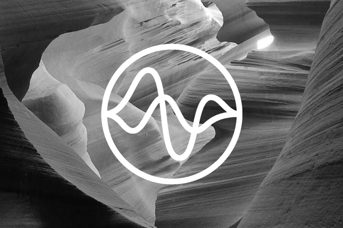
The circle is an unbroken line illustrating IMS’ comprehensive and persistent approach. Simultaneously, the circle refers to the global dimension of our work.
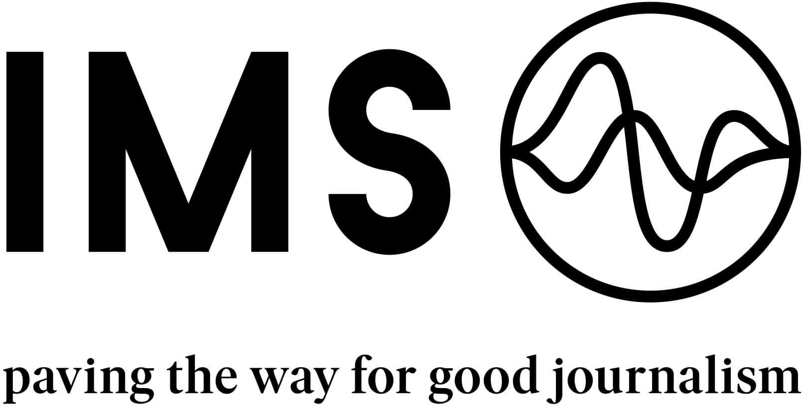 The waves inside the circle mirror the soundwaves of two different voices pronouncing “IMS”. They symbolise the importance of flexibility and adaptability and of creating a bridge between the many local initiatives we support and the international human rights principles we embrace together.
Tagline
Our new tagline speaks to the core of IMS’ mandate which indeed centers on ‘paving the way for good journalism’.
Secondary colours
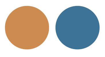 The secondary colours that frame our new visual identity are based on the elements of bedrock and water, visualising two of IMS’ core values: A solid rights-based foundation; and a flexible approach constantly adapting to change.
IMS’ new logo and visual identity is developed by NR2154 with substantial input from the organisations’ staff.