Impact in a visual wrapping
From three continents, Visualizing Impact is filling the world with powerful visuals making heavy material accessible. The mission is to generate change.
The name says it all. The mission of Visualizing Impact (VI) is precisely that: Using powerful visuals to create change in society.
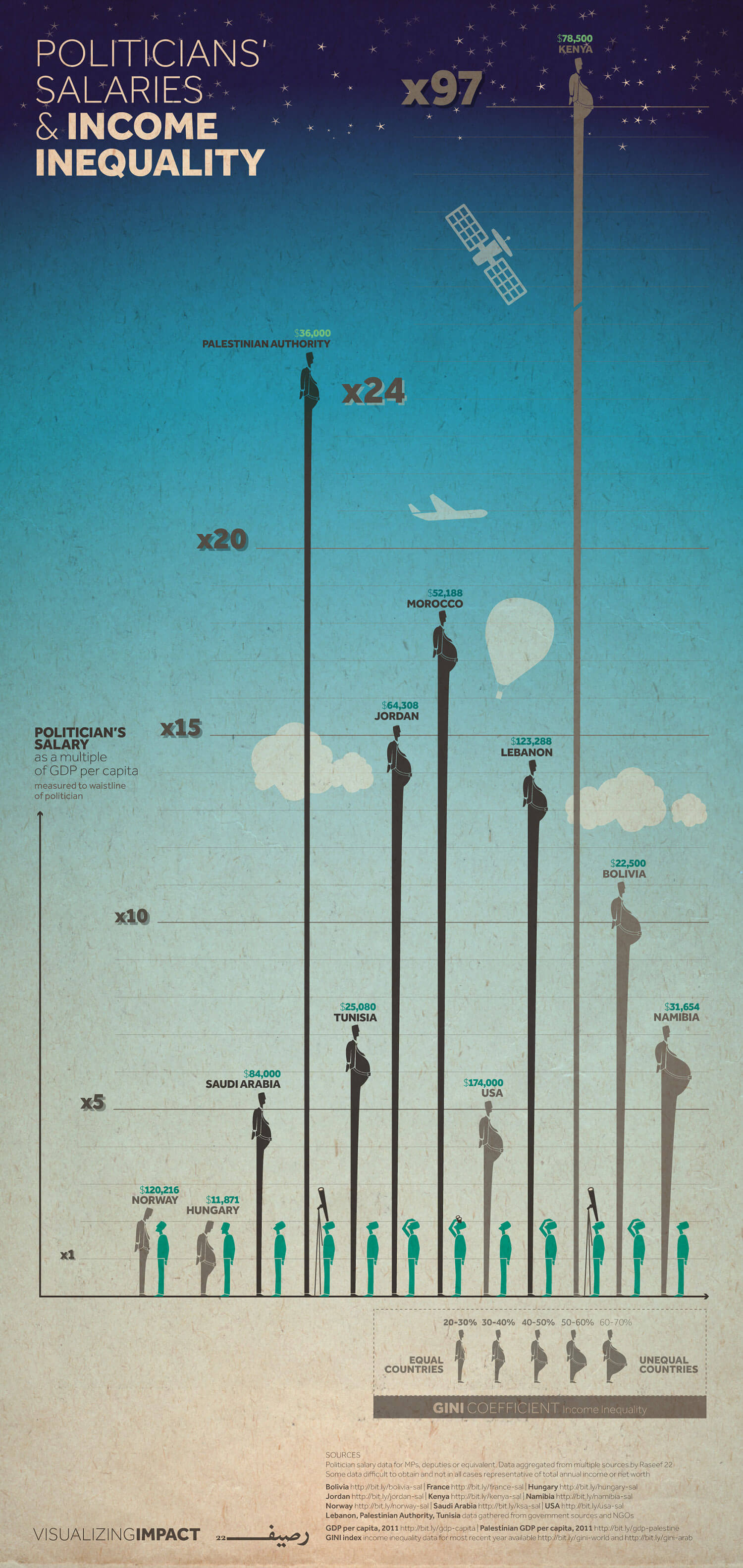
Their look is simple, yet colourful, direct and extremely recognizable. Take for instance the vertical visual depicting income inequality by looking at politicians’ salaries compared to the GDP per capita. If written, the story would have been heavy and full of numbers and economic lingo, whereas the poster conveys the message in an easy – and beautiful – way.
“People are more able to interact with visuals and storytelling than they are with stiff data and numbers. When the information is visualised, or compared to something you can relate to, your brain makes an identification and creates a sticky memory. We are hearing a lot of news every day, but what sticks is what creates an impact and what creates a change,” says Yosra Gamal, 23, who works as an information designer with VI.
Lost in information
It all began way before in 2011 when two of the three founders, Ramzi Jaber and Joumana Al-Jabri, were working on bringing Ted-EX to Ramallah.
In that process, they came across a lot of inspiring stories, data and reports with valuable information, which were not being read by the public or shared in mainstream media. The consequence was that the information was lost.
Out of the need to develop a simple tool to spread the lost information to the world, Visualizing Palestine was born – in 2013 it transformed into Visualizing Impact accommodating not only data on Palestine, but data from the entire world.
The current set-up consists of 10 people spread across three continents – Yosra Gamal is based in Cairo, and other team members are based in places like Toronto, Boston and Dubai, just to mention a few. Besides from the 10 core team members, VI works with a number of networks, partners and advisors from all over the world.
Measuring impact
To try to define VI would be a lost cause. They are not activists, though some might define their content as activism. They are not journalists in the traditional way, though they use data-driven journalistic tools in their work, nor are they an art or design outlet, despite the artistic products.
“For us, the target is the people – it is not that we target designers or techies or journalists; we really want to spread information to the people while taking a factual and journalistic approach,” says Yosra Gamal.
Besides from measuring their reach on Social Media, the team behind VI are very focused on measuring where and for what purpose their visuals have been outside the digital world.
As part of their wish to spread information and generate change, VI has a Creative Commons licence allowing people to share their work unchanged for non-commercial uses if VI is properly credited. When people download VI’s material from their webpage, they are asked to provide information on what they will use the visual for, how they are going to use it, and how it will help them convey their message.
“There are definitely still people who do not report back to us, but it helps us track where our visuals are being used and if they are being used or not. And they have been used quite well,” says Yosra Gamal.
The downloads come from all over the world and so far, VI’s visuals have been featured in e.g. exhibitions and advocacy campaigns, on media platforms as prominent as Al-Jazeera, The Guardian and The Huffington Post, and by student groups, academics and private persons.
From idea to a visual
For the past year, VI has developed a production mechanism, where they publish new visuals every two weeks. This consistency has proven quite successful given that both reach and number of subscriptions on social media have been growing.
Ideas for visuals are cultivated collectively, but for an idea to be good it must fall under the large umbrella of ‘social justice’ and it must be heavy on data.
“To take really heavy data and transform it into a simple visual that the public can understand and interact with is really our strength,” says Yosra Gamal.
Besides from the overall editorial criteria of ‘social justice’, VI changes focus every three months. Coming up is a focus on hope, and visuals should therefore tap into a broader story on solidarity and collective actions and reflect that there is hope and possibility for a change.
The process when going for idea to visual is far from linear. It is back and forth a million times, angles are discussed, the wording is discussed, and facts are checked and rechecked, and the graphics are being worked on over and again before the final result is ready.
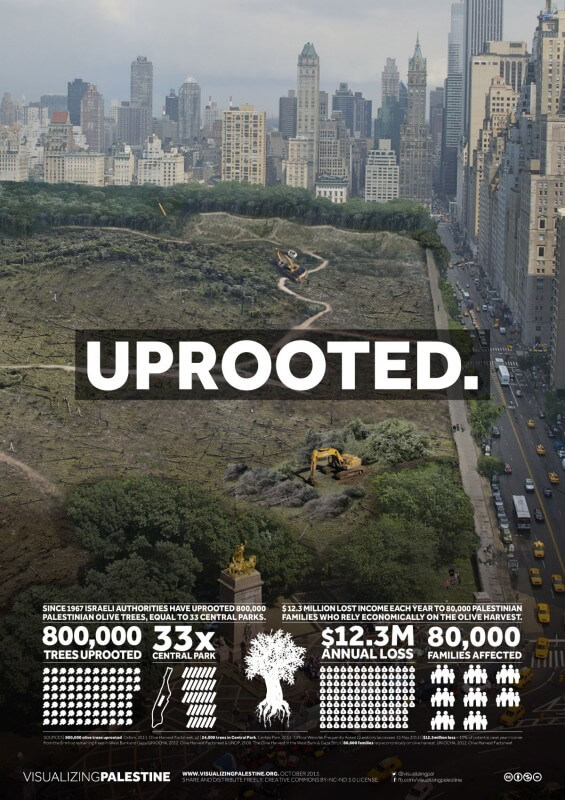
The trees in Central Park
An effective visual must be decodable without the text. It must touch upon and change something inside the viewer, who ideally also should be able to relate to it. Making their stories relatable is something the VI team prioritise.
Take for instance the visual of olive trees in Palestine. There is a large amount of olive trees in Palestine and they have sentimental value to the Palestinians; but since 1967, 800,000 trees have been uprooted. To visualize this number and make this visual resonate with the viewers, VI compared it to Central Park in New York. 800,000 trees equal to 33 Central Parks, and the visual reading ‘Uprooted’ plays on the idea that what if New Yorkers woke up one day and found the trees in their park uprooted? Not just once, but 33 times?
“So now at least, our American audience can relate to the visual in a different way and every time they pass by Central Park they can imagine what it would be like if all the trees were gone,” explains Yosra Gamal.
A collective effort

Asked what is her personal favourite visual, Yosra Gamal hesitates and says with a laugh: “They are all my kids.” Nevertheless, the very first visual she ever did with VI represents something special to her – not only because it works in every way, but also because it is an example of the unique collaboration within the VI team.
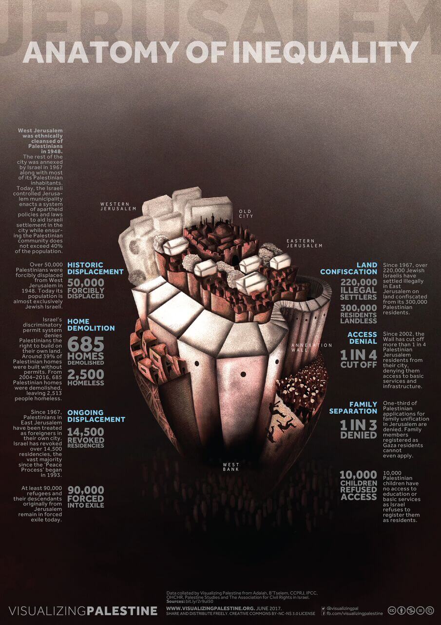
The visual is called ‘Jerusalem – anatomy of inequality,’ and when Yosra Gamal was briefed on it, her colleague, Iman Annab, mentioned that what was happening in Jerusalem is a symbol of what is happening in Palestine in general and that Jerusalem was like the heart of Palestine.
“It really resonated with me when she said that, and it became the inspiration for the entire visual that looks like a heart and really symbolized everything that is happening in Palestine – the forcible transfer of people, the demolishing and all of that,” Yosra Gamal explains.
When she sent the first draft, another colleague, Jessica Anderson, saw it and because of the heart shape, she came up with the name ”Anatomy of inequality”.
“It really made me realise how this is a collaborative thing, and in the end when I see the visual I am able to see every effort of every team member and how they brought this visual to the end result,” Yosra Gamal says.
IMS has been engaged on several projects with Visualizing Impact since 2014. But As per 1 October the partnership has entered a new phase, which focus on developing a membership programme, which will generate revenue to sustain VI’s budget and develop the community surrounding the group.